

Designing intuitive navigation in a cloud database platform is no small task. TiDB Cloud offers powerful features, but as capabilities expand, so does the complexity of its interface. Users often work across multiple roles, organizations, and environments. If they can’t find what they need quickly, it slows them down and weakens their trust in the platform.
We set out to make navigation easier, more reliable, and more aligned with how people actually use the product. That meant supporting both power users and newcomers, reducing friction, and keeping the experience stable and scalable.
In our previous blog, we walked through the key changes made to improve TiDB Cloud’s console navigation. In this follow-up post, we’ll detail the research process we went through to arrive at these changes.
What We Set Out to Learn
As TiDB Cloud evolved, our menus became crowded. We knew we needed a smarter structure — one that could grow with the product. So we redesigned the navigation from the ground up and turned to user research to test our assumptions.
Our design team set three goals:
- Build a navigation system that is scalable, consistent, and easy to understand.
- Align the structure with how users think and work.
- Deliver a smooth experience that reflects our brand.
We focused our research on four key questions:
- Do users understand the new navigation groups and hierarchy?
- Can they quickly locate actions within different resource contexts?
- Can users in different roles use the system effectively?
- Are the names and groupings consistent with user expectations?
Phase 1: Prototyping and Task-Based Testing
To test our early assumptions, we built a high-fidelity prototype of the new navigation and created realistic tasks for usability testing. Participants were asked to complete common actions such as:
- Finding where to import data.
- Switching clusters to view details.
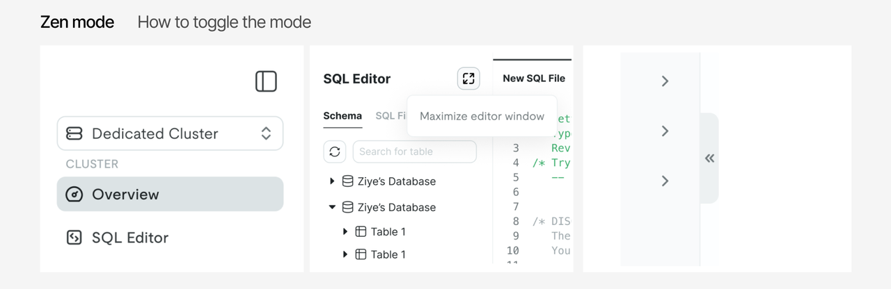
- Opening the SQL Editor and running a query in Zen mode.
- Checking this month’s billing at the organization level.
Researchers observed participants as they completed these tasks in the prototype, recording their actions, comments, and navigation paths.
We also conducted a card-sorting exercise to explore how users mentally group different features. Participants received shuffled cards with feature names and were asked to organize them into groups that made sense to them. Each participant explained their logic and usage habits. To ensure a broad range of feedback, we included seven users across different roles, including software engineers, DBAs, and support engineers, with varying levels of experience.
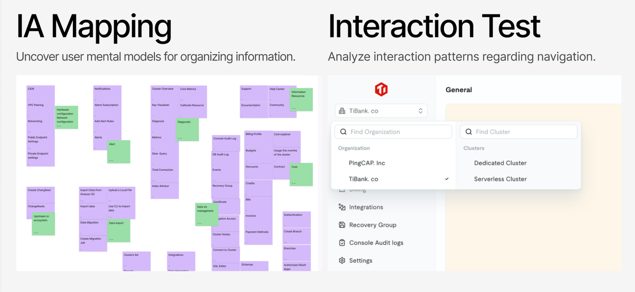
Prototyping and Task-Based Testing Conclusions
From these sessions, we gained several key insights:
- Users understood the structure. Most participants quickly grasped the multi-level menu layout. Many grouped items in ways that closely matched our proposed structure.
- Group size matters. Around six items per group felt manageable and helped users scan and remember options more easily.
- Task-based grouping works. Experienced users tended to organize by task rather than by product feature, though newer users leaned toward grouping by function.
- Zen mode was unclear. Participants were confused by the term “Zen mode” and struggled to find it. The entry point needs to be clearer and more intuitive.
- Menu level was sometimes ambiguous. A few participants weren’t sure which menu level they were on, due to a lack of clear visual cues.
Using this feedback, we refined the navigation design across several iterations. We adjusted level switching, collapse behavior, and added clearer visual indicators. After each round of changes, we ran quick validation tests to confirm that the updates addressed the problems without creating new ones.
Phase Two: Internal Preview and Survey
After launching the new navigation in an internal preview, we gathered detailed feedback through a survey and usage metrics. This phase helped confirm the overall direction and highlighted areas for further refinement.
We also ran an experiment by hiding the onboarding upsell flow for a subset of users. This tested how easily users could explore and learn the new navigation on their own.
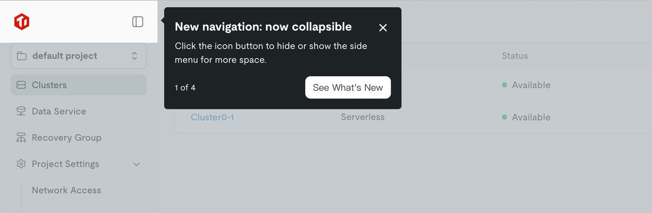
Among 176 users who saw the upsell, only about 30% clicked to continue. But nearly all who started the flow completed it, showing that the content was engaging and held users’ attention.
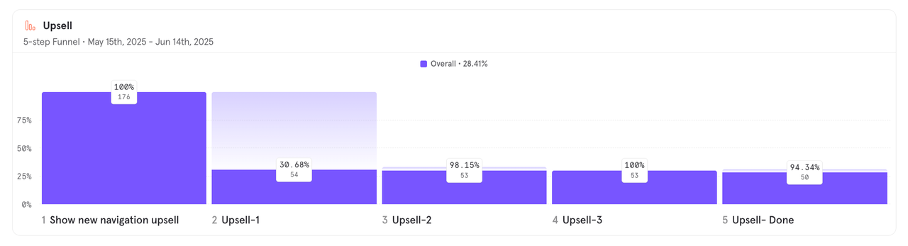
We combined click data with qualitative feedback from 48 survey responses to assess satisfaction. Results showed that users who completed the upsell rated the navigation slightly higher than those who skipped it or didn’t see it. This suggests the upsell added value, without being a barrier:
- Completed: Slightly higher satisfaction, showing the upsell improved understanding.
- Dismissed: Still rated the experience highly, indicating the upsell was not intrusive.
- Not Shown: Scores remained positive, showing the navigation was intuitive even without guidance.
| Navigation CSAT | All | Completed Upsell | Dismissed Upsell | Not Shown Upsell |
| Avg. Score | 8.1 | 8.16 | 8.11 | 8 |
| Number of Users | 48 | 19 | 18 | 11 |
Internal Preview and Survey Conclusions
From this round, we drew clear conclusions:
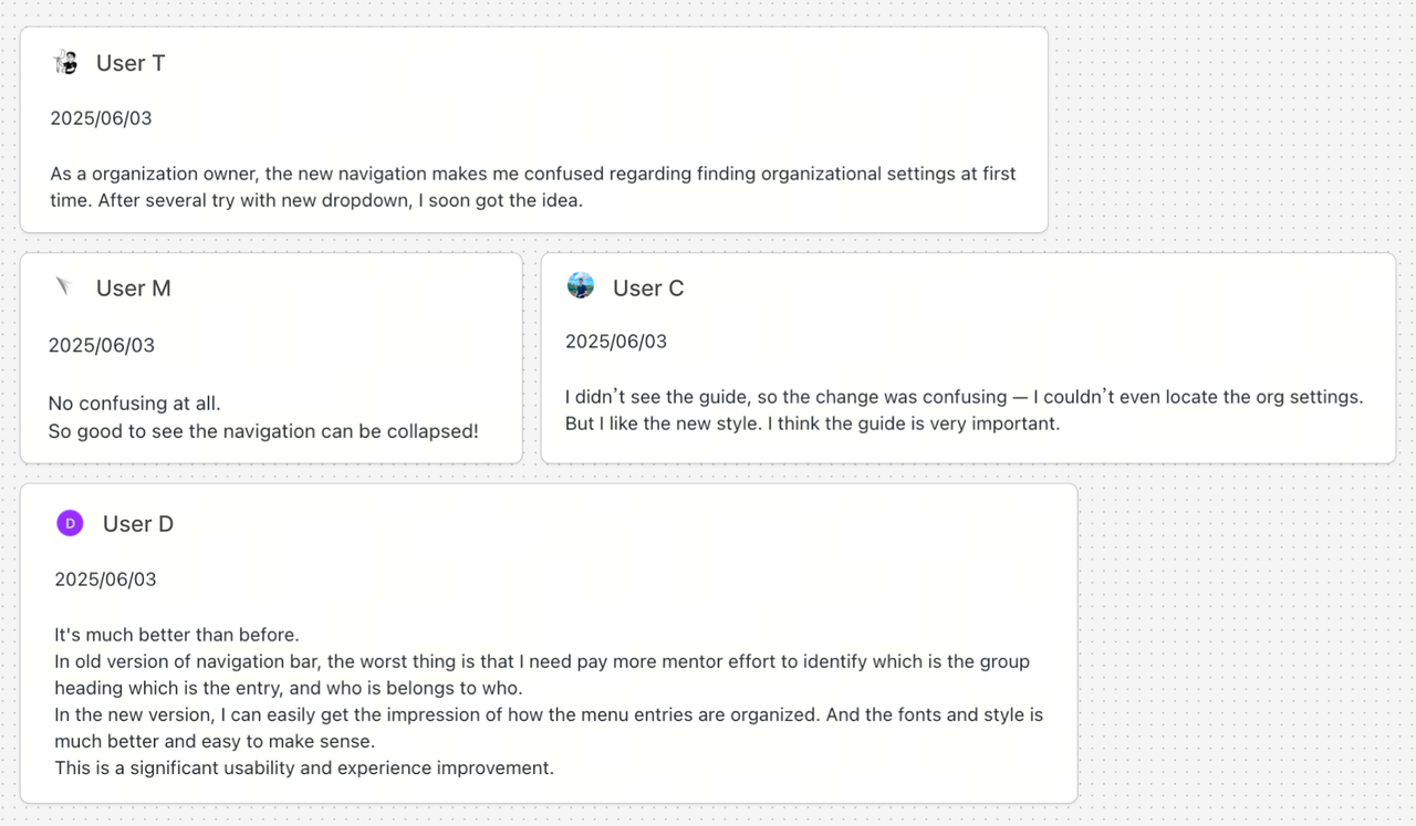
What’s working well:
- Visuals are well received. Users described the design as clean, modern, and simplified.
- Structure is clearer. Navigation felt easier to understand compared to the previous version.
- Onboarding adds value. Those who completed the upsell found it useful and informative.
What needs improvement:
- Long cluster names. Truncated names in the dropdown made it difficult to distinguish clusters.
- Organization settings. Key admin pages like “Users” were hard to locate.
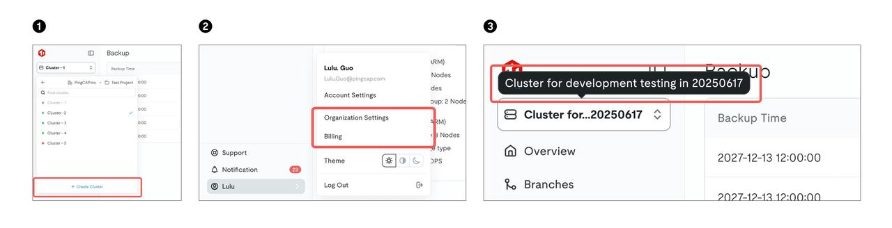
Based on this input, we made several improvements:
- Added a “Create Cluster” shortcut in the resource dropdown.
- Added quick links to “Organization Settings” and “Billing” in the user menu.
- Enabled full cluster name visibility on hover when truncated.
- Continued optimizing flows to reduce friction and increase efficiency.
These changes further strengthened the experience and set the stage for the broader rollout.
Conclusion: Iterative, User-Informed Design
Designing navigation is never a one-time effort. It requires ongoing iteration grounded in how users actually work. Through this research, we saw how easily a design that seems reasonable can fall short in practice. Only by testing with real users and observing real behavior were we able to uncover gaps and validate what works.
User feedback helped us move beyond assumptions and make targeted improvements that enhanced clarity, structure, and ease of use. Research didn’t just support the design—it shaped it.
As the Nielsen Norman Group says, “Even the best designers cannot create a perfect experience without real user validation.” We’ll continue to take a user-centered approach, refining navigation based on direct input and making TiDB Cloud easier to navigate with each iteration.
With that said, we’d love to hear from you. Give us your feedback so we can continue to build a better experience for everyone.
Spin up a database with 25 GiB free resources.

TiDB Cloud Dedicated
A fully-managed cloud DBaaS for predictable workloads
TiDB Cloud Starter
A fully-managed cloud DBaaS for auto-scaling workloads